
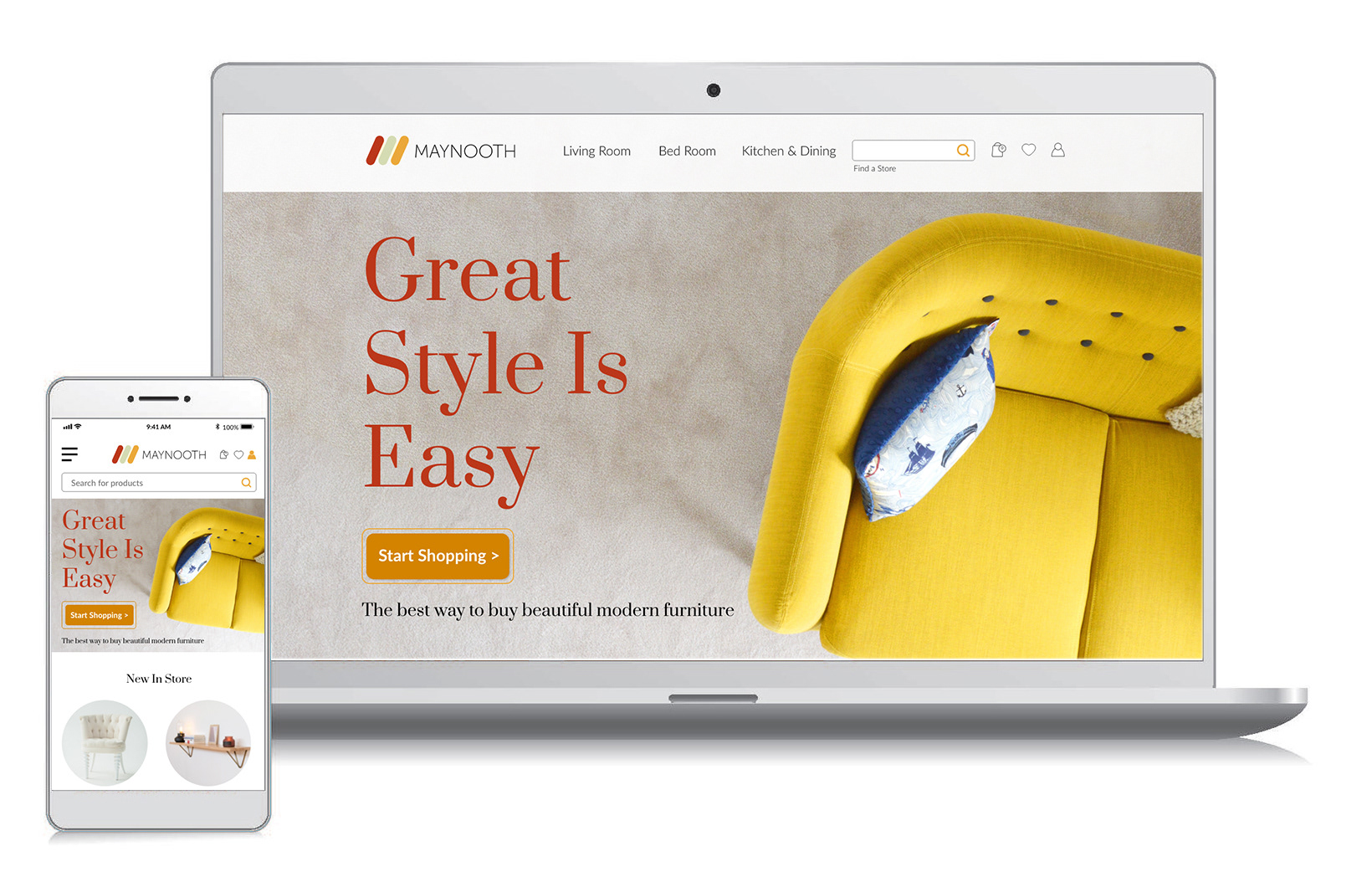
The Project: Maynooth Furniture is a new business selling affordable high-end design furniture made in Ireland. They are looking for building an e-commerce website for people to browse and to purchase furniture for home delivery.
The Problem: With a number of furniture e-commerce websites in the market (i.e. IKEA, habitat, etc), we need to create a site that's elegant, unique, and stands out.
My role: Understanding the persona profile and map out the whole user journey. Checked out some of the current competitors and see what elements can be added to the site to enhance the user experience and to make it stands out in the market.
Deliverables:
- Wireframes for client approval
- High fidelity prototype
- User Testing (hallway testing and unmoderated remote testing)
- UI Assets for developers
- Wireframes for client approval
- High fidelity prototype
- User Testing (hallway testing and unmoderated remote testing)
- UI Assets for developers
Tools:
Adobe XD, Adobe Photoshop, Adobe Illustrator, and Adobe After Effect
Adobe XD, Adobe Photoshop, Adobe Illustrator, and Adobe After Effect

User Journey Info Chart

User Journey Mapping
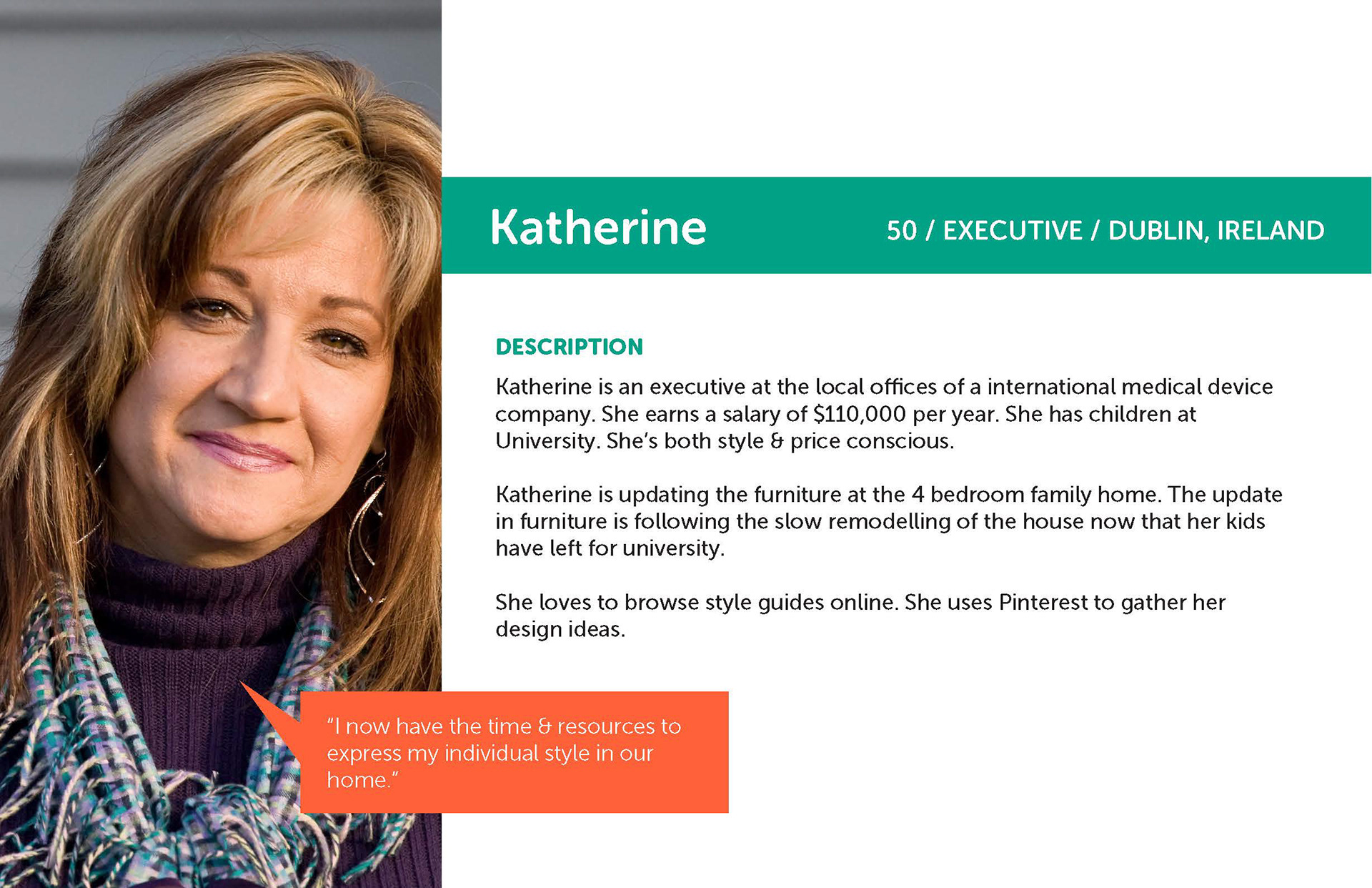
User Profile
User Persona Exploration
Katherine is the user persona for the Maynooth Furniture website. Understanding her background, financial status, and hobby allows me to map out her scenario and expectations toward a good furniture e-commerce site that fits her.
Because her kids have left for university, she can finally have time to enjoy her life and her house. As an executive of a company, she is only interested in furniture that is modern, elegant, unique, and of good quality, IKEA is not her go-to place. The website should reflect those characteristics as well.
Based on Katherine's profile, I can map out her different stages of the process from Awareness to Possible Outcome. From there I can map out the whole user journey in order to create a site that meets her needs and answers her questions.
Wireframe Sketches
Throughout the research, I discovered a lot of the current furniture e-commerce sites are quite busy and overwhelm with options and information. I decided to go with a more simple direction, with lots of negative space and beautiful product shot to let the product speaks for itself.
When the end-users landed on the page, it gives them a sense of calmness and enjoyment. An inspiration idea section will get automatic feeds from Pinterest and another social platform to allow customers to share their posts of how they use the product in their own space. It gives ideas to new customers and is a great way to showcase trustworthy testimonials in a visual way.
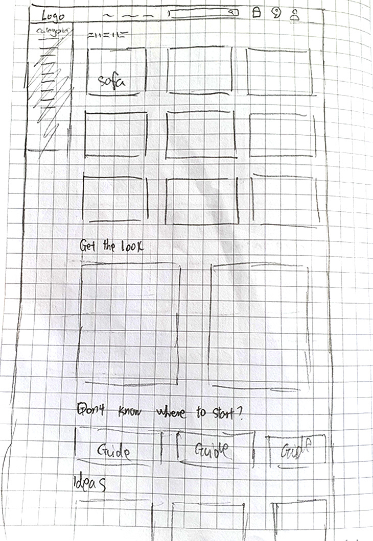
Category page sketch

Product page sketch
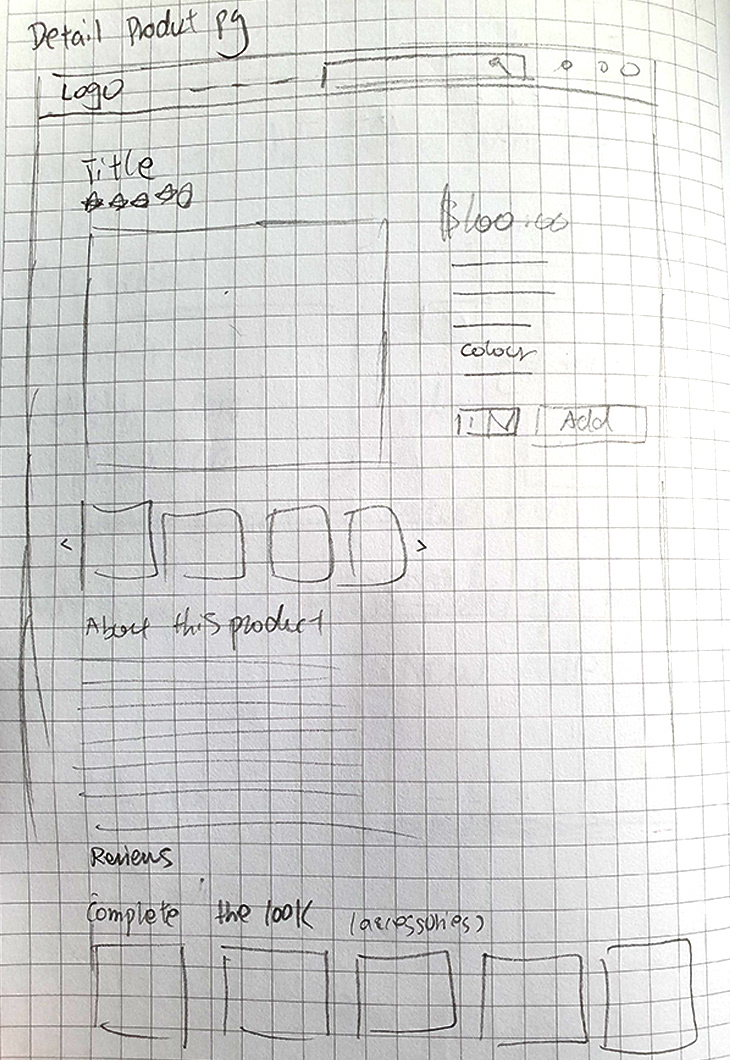
Detail product page sketch

Home page sketch

Sofa page sketch
Lo-Fi Wireframing
After the sketches are done, I used Adobe XD to mock up the Lo-Fi wireframe to showcase my ideas and the workflow between the pages. These wireframes also served as the base for the clients to get a visual understanding of the information architecture of the site.
Product Options

Product Detail

Sofa Cateogry

Home
Categories
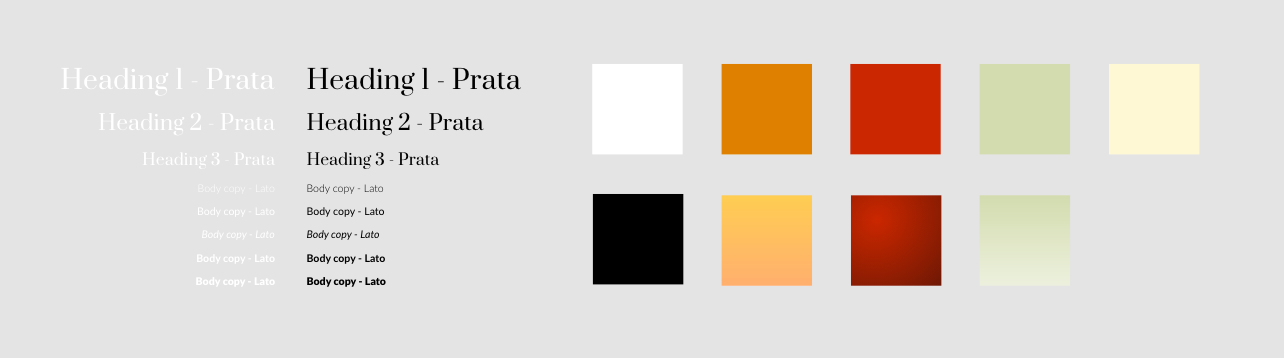
Visual Guide
A basic visual guide was created for the high-fidelity wireframes. The primary colours are the main logo colour.
High Fidelity Wireframes
Based on various research and clients' feedback, it is time to develop high fidelity wireframe to bring this site to life.

Mobile view at a glance
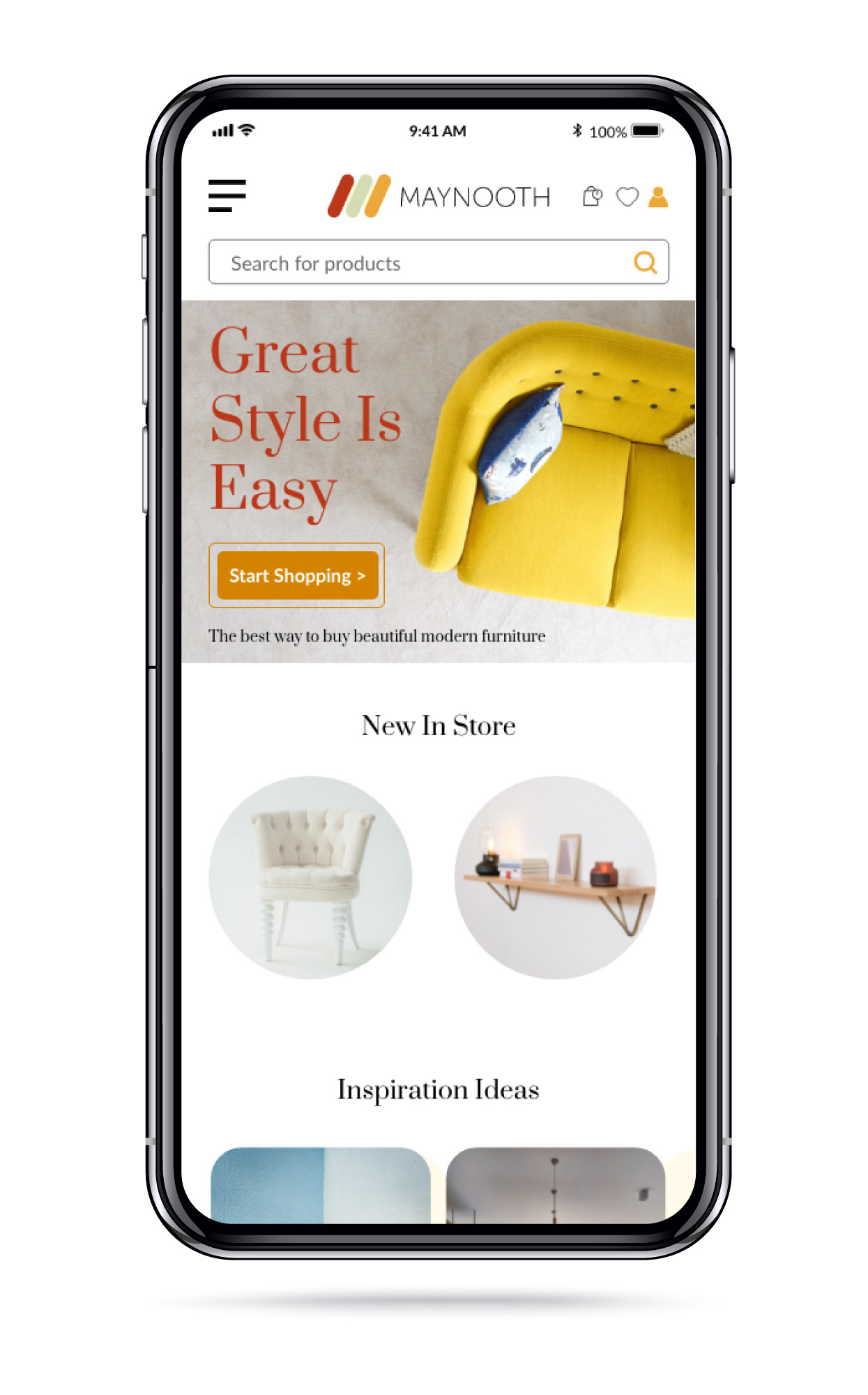
Home page in mobile view

Category page in mobile view

Product page in mobile view

Log-in page in mobile view

Sign-up page in mobile view
The video shows how the end-user navigate the desktop site.

Home Page Analysis
A stunning hero image is a key to create this wow factor for the end-user once they landed on the site. Stockphotos should not be used across the site. There are 4 main sections on this page, Start Shopping CTA, New In-Store, Inspiration Ideas, and Find Your Perfect Match.
Start Shopping CTA: It is an e-commerce site after all, so a call-to-action is important to have above the fold. It can act as a shortcut for return customers to start shopping right away.
New In-Store: An overall glance at the new arrivals. It also sets the tone and style of the type of products this site carries.
Inspiration Ideas: The user persona is an active user on Pinterest and other social platforms. It is important to integrate automatic social media feeds on the site for both SEO and SEM purposes. This section also serves the purpose of making the site a one-stop shopping platform, where allows the end-user to do their research while shopping at the same time. It also increases the engagement rate of the site and reduces the bounce rate.
Find Your Perfect Match: It is a section for discounted items. Last chance to engage the end-user before they exit the page. Since the bottom area of the site is usually the cold spot, locating something that most people are interested in might make them stay longer.

Category page above the fold in desktop view

Category Page Analysis
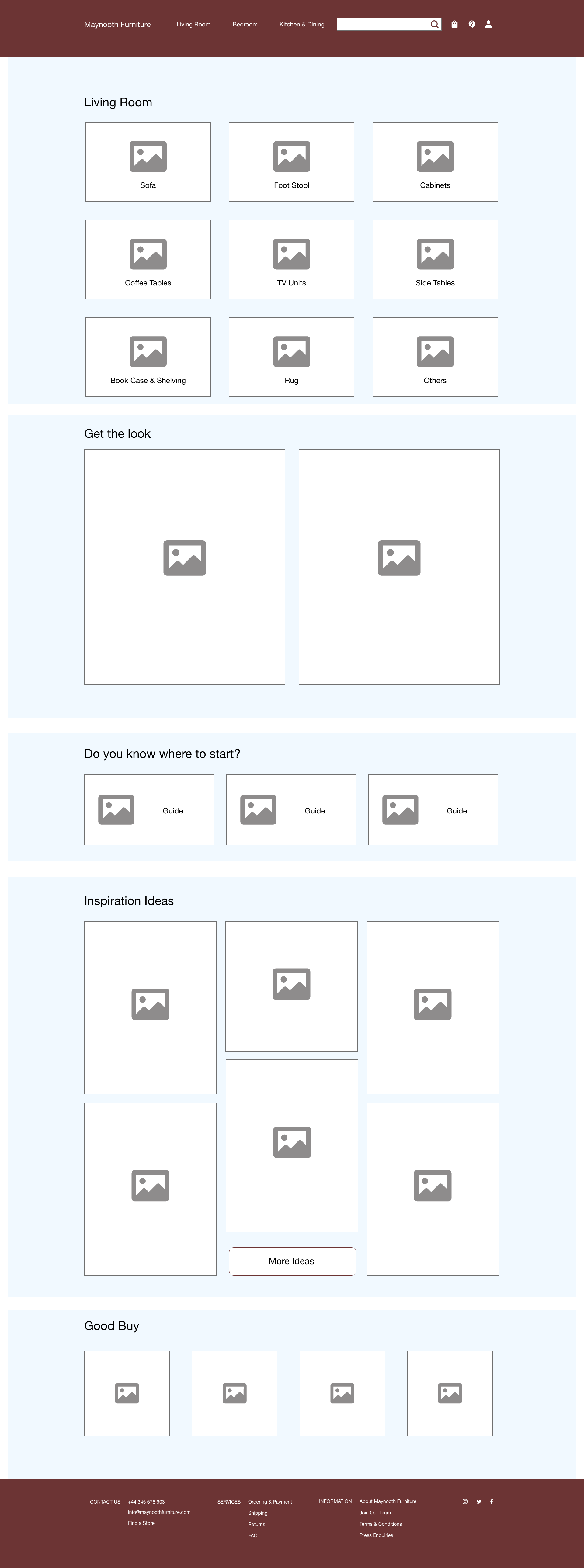
The whole site is divided into 3 main categories: Living Room, Bedroom, and Kitchen & Dining. Each category contains products related to that specific area. End-users can browse through relevant products based on the category ties to their need.
Get The Look: This section includes actual product shots of rooms decorated using Maynooth's products. This area allows the end-user to get a sense of the actual look and feel of how the products can bring to their home. We also include hotspots on Maynooth products to allow the end-user to click on it and see more product detail.
Don't Know Where To Start?: Not everyone is an expert in remodeling their homes or finding the perfect piece of furniture. Maynooth is here to help. The site contains resourceful content for the end-user to have access to. All they need to do is to sign-up and become a member or to simply leave their name and email. These gated contents are one of the marketing strategies for lead generation purpose. They provide benefits for both the end-user and the company.
Inspiration Ideas: This idea section only filters down to social posts that are relevant to Living Room products. Since the end-user is interested in Living Room, it helps to narrow down their product options to allow them to focus on tasks. Just like when you know you are looking for a couch for your living room, you wouldn't expect to see an inspiration idea on the fridge organizer. We don't want to overwhelm the end-user with options to create distractions. The goal of the site is to help not to create more problems for the end-user.
Find Your Perfect Match: We ended the page with on-sale items that tie back to the relevant category.

Sofas page above the fold in desktop view

Sofas Page Analysis
Now that the end-user is interested in Sofas. We have all the sofa types that Maynooth carries above the fold as the visual navigation to provide easy access. At the same time, we maintain secondary navigation at the top of other products relevant in the same category.
CTAs: Here we have 3 CTAs to enhance the shopping experience of different users' needs. For users that want to see the whole collection, can simply click on "Our Collection" to see the whole product list. For beginners, users can get some support from the guides that are curated for them. For users that want to know more details of the product, there are material catalogs for them.
Top Picks: This section showcases the most popular sofas that were purchased by other customers. It also includes popular items by rating.
Get The Look: This section showcases different styles of sofas that Maynooth carries in a different setting. It serves as an inspirational hub at the same time provides a sense of realism to the end-user. We also incorporate some hotspots on the product to allow the end-user to click on it to see more product detail. If they want their room to be in a certain style within the inspirational hub, they can do so by having this specific couch.

Product page above the fold in desktop view
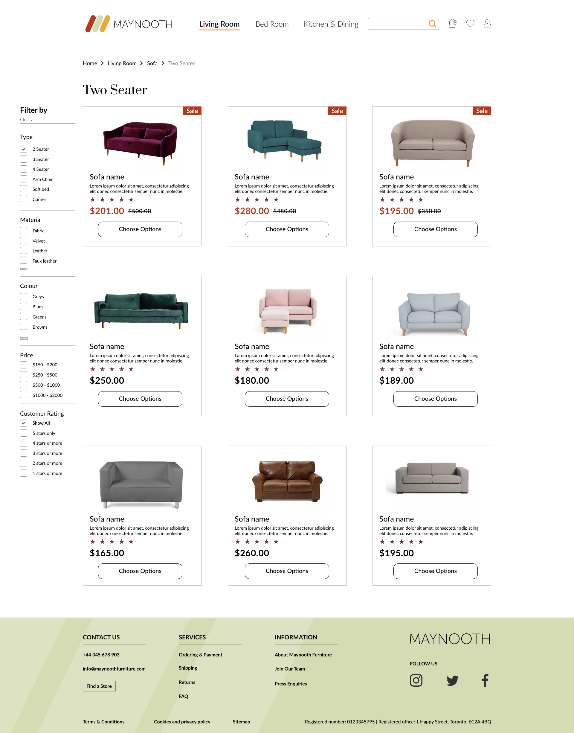
Product Page Analysis
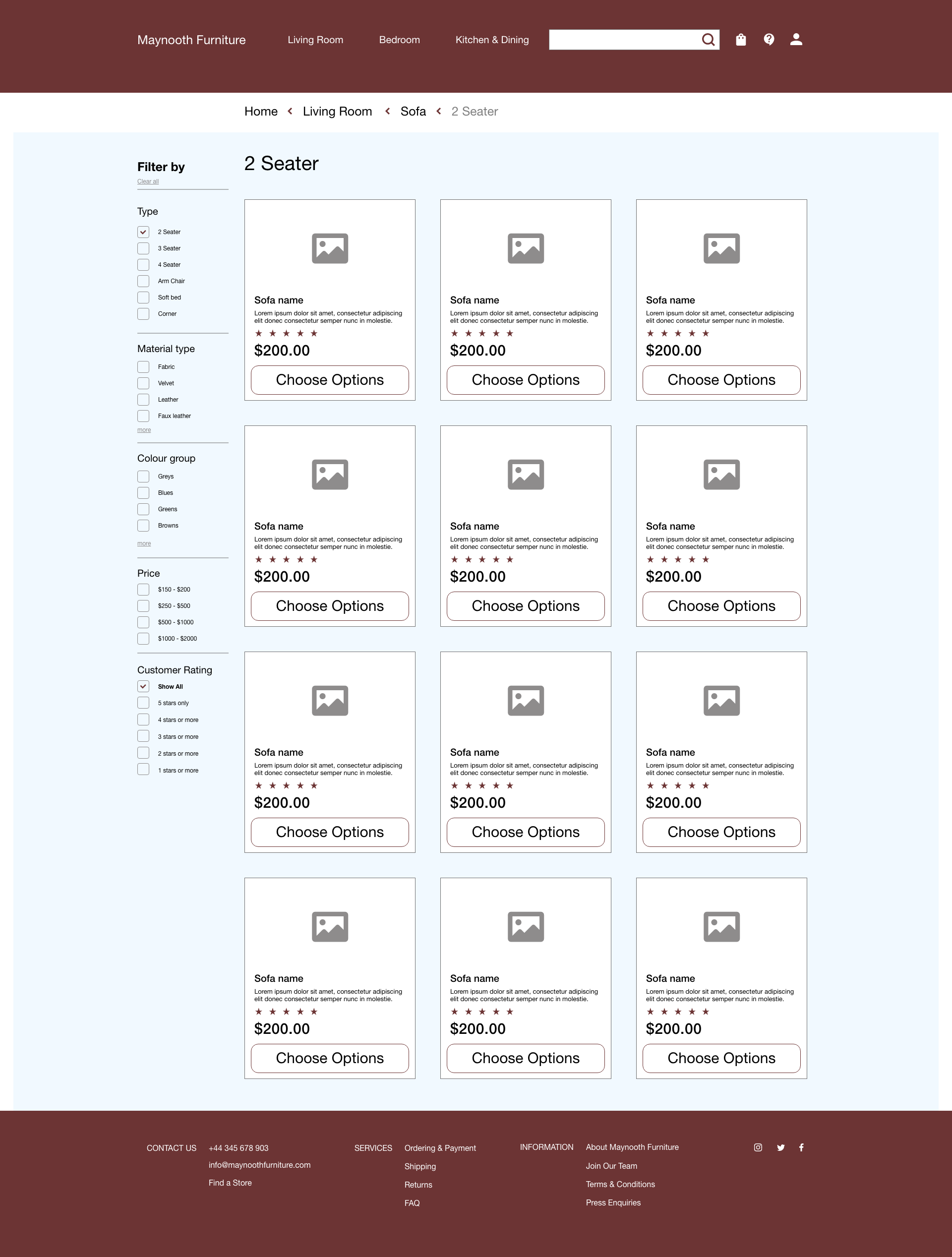
The end-user is very close to the end of the purchasing funnel. Here the end-users already know they are interested in a Two Seater sofa. Having the Sale items at the top can increase the chance for them to see their benefit. Pricing often kicks in place when it comes to decision-making. Also, a Filter is included on this page to allow the end-user to filter out options that are irrelevant to their need.

Product Detail page above the fold in desktop view

Product Detail Page Analysis
A product detail page is a key in all e-commerce sites. This is the final step before the end-user click on the most important CTA: "Add To Bag". Having all the detailed product shots, colour options, detailed info and customer reviews of the chosen product can help the end-user to be educated before making their final purchase.
Complete The Look: This section is added on this page to influence the end-user for adding other relevant items to their basket. It also acts as an inspirational area for the end-user. It is similar to the goodies that you find beside the cashier in the check-out area. There are always last-minute items that the end-user might be looking for.